01 / 08
Hanstholm from above
It makes me feel protective of a place that refuses to perform its beauty. The hard little roads and low buildings don’t put on a show. I admire their ordinary stubbornness.
 HANDMADE / MACHINE READ
At first, I thought this might be a good little twist. What would artificial intelligence make of my work? Would it measure beauty like a spreadsheet, match my symbols and metaphors against everything people have written and painted before us, and then announce that it had decoded the feelings I hoped to stir in viewers with souls — or at least a few scraps of one left after civilisation's ongoing, largely involuntary experiments on us?
I was hardly innocent about AI. I knew what it could do. But what frightened me wasn't its lack of intelligence. It was how little it understood the difference between an emotion and its performance — and how confidently it could imitate both. It could identify a joke and file laughter under 'feeling'. But laughter isn't a feeling. It's an expression. People laugh from joy, cruelty, nerves, embarrassment, despair, even grief. The same sound can hide completely opposite things.
Art, to me, is not a successful arrangement of symbols. It needs curiosity. Empathy. Attention to the tiniest stimulus and some sense of where you want to take the person looking. Sometimes I want a smile to curdle. Sometimes I want tenderness for someone the viewer might pass on the street without a second glance. Sometimes I want them to feel uncomfortable and not quite know why.
Then the experiment turned back on us. Because some people among us are remarkably good at performing empathy without seeming to understand another person's feelings. What if I asked a human with pronounced psychopathic traits to review the same images? Would the result sound any different? Would I even notice? I'm not suggesting that a diagnosis can tell us everything about somebody's inner life. I'm asking how easily we mistake the description of emotion for the understanding of it.
So this website became part of the work. Not a test of whether AI can be human. Not a certificate of artistic merit issued by a machine. A place where language gets painfully close to feeling — and where the distance between them may tell us something about ourselves.
This website is also a work: a staged encounter between analogue traces and synthetic interpretation.
ENTER THE EXPERIMENT ↘When amusement becomes grief, what changed — the picture, or the person looking?
The images, prints, photographs, graphics and installations on this site were made through a human practice. Their accompanying critical readings are written by artificial intelligence: first the emotional response the work appears to produce, then the visual reasoning that could produce it.
The readings study contrast, scale, rhythm, balance, composition, visual hierarchy, material and symbolism. They also examine where a metaphor becomes too convenient or a gesture refuses to explain itself. The work remains larger than either reading.
A HUMAN MANIFESTATION / INCOMPLETE BY DESIGN
Seven names for the appetites, contradictions and failures of bodies that desire, age and die. This series is addressed to those bodies—not to the machine reading it.
DESIRE / POSSESSION / GUILT / THE SHORTNESS OF A HUMAN LIFE
Seven Deadly Sins of Thy is a manifestation addressed to humanity alone. Its subject is not moral perfection but the instability of being human: the hunger to possess, the shame of desire, the arrogance of certainty, and the short time in which any of it can matter.
A machine may read a pink light as temptation and a gold stone as greed. It may follow the symbols, identify the contrast and build an argument. But it does not stand before its own mortality. That is the paradox of asking it to interpret this work: it can analyse the language of being mortal without having to live its consequences.
Desire hurts because time runs out. A machine can name that hunger; it cannot dread the ending. Lust and greed are not merely bad behaviour here; they are forms of wanting produced by the knowledge that things end.
A.I.FORMTwo lonely landscapes, two coloured traps. Strong opening. Five more variations could become a formula. Both works place one seductively coloured interruption inside a largely drained landscape.
The light is enough. The rest happens in the head.
A small pink light turns distance into appetite. Then the loneliness catches up. The cabin is barely there, yet the pink light has the power to make the mind travel across a field.
A.I.FORMPrecise restraint. An OPEN sign flirts with cliché; the emptiness rescues it. The distant scale and monochrome space are crucial.
Change one colour and the whole field starts negotiating.
A stone becomes treasure and the viewer feels complicit. An ordinary stone receives the colour of money, and immediately the viewer's attention becomes an act of valuation.
A.I.FORMOne gold accent, one clear thought. Too neat alone; stronger in the series. Selective colour does almost all the work, with very little composition to disguise the concept.
They gave the street a life no plan could have written. Then they were gone. The corner stayed.
“Flemming.. hvem tror du bor her?”
First, amusement. Then loss. The dialogue ridicules a perfectly curated life while two very uncurated lives take up the whole wall. They belonged to this street on their own terms, for less time than anyone deserved.
A.I.FORMHard black silhouettes cut through the brick. Scooters, baskets, bottles and colloquial Danish refuse an immaculate memorial. The satire is obvious; the affection is what saves it.
These photographs trust the second before self-awareness barges in. Nobody is posing for the verdict. That is why the pictures breathe.
Attraction, affection, alarm. These people were not performing for anyone. The strongest photographs find people in the interval before self-consciousness: a hand raised, a glance at a phone, somebody working or hurrying through a door.
A.I.FORMThe strongest frames catch a gesture that changes the whole scene. Others are only strangers in passing. Keep both truths. Timing matters more than perfect geometry.
Alarm. The man raises a hand and the watcher is suddenly the one being watched. There is a tiny reversal of power in that raised hand. Instead of a harmless candid picture, the scene becomes a meeting between two people with different ideas about being seen.
A.I.FORMThe gesture breaks the frame. That confrontation matters more than perfect composition. His face, hand and camera form a tense triangle.
Two lives almost touch at number 40, then keep moving. Nothing dramatic. That is the ache. The woman stays with her own task while another person crosses the edge of the frame.
A.I.FORMIronwork, street number and car mirror stack frames inside frames. Separation becomes the subject. The gate's loops and vertical bars impose order on an untidy human moment.
A man, a phone, a vacant seat. Loneliness without the performance of tragedy. He seems present and elsewhere at once. The chair beside him is not tragic by itself, yet its vacancy makes the ordinary act of looking down feel unexpectedly private.
A.I.FORMThe tile grid holds him still; the empty chair does the talking. Quietly exact. The repeated tiles and plastic seats make a rhythm that has no warmth.
A little warmth among bananas and handwritten prices. Someone working, not auditioning for charm. The ordinary care of commerce has its own dignity.
A.I.FORMThe visual clutter earns its place. Clean this photograph up and you kill it. Signs interrupt faces, bodies interrupt the stalls, and the image holds all of it without choosing a hero.
That scarf, that posture: effortless swagger. Then the phone steals the attention. Vanity meets traffic. A smart outfit becomes almost comic beside a bicycle and a phone. There is pleasure in the confidence, and a small sadness in how thoroughly distraction has occupied the present.
A.I.FORMHandlebar across the body, movement against distraction. The photograph lands because nothing quite aligns. The bicycle cuts across the figure like an underline.
Two people inside a private rhythm. It feels kind to be left outside their joke. Their exchange appears complete without an audience. That makes the photograph feel generous, as though it grants us one glimpse and then politely asks us not to intrude any further.
A.I.FORMDark shutter, small gestures, no spectacle. Easy to overlook; worth the extra second. The dark doorway absorbs detail, making the visible gestures matter more.
Tenderness for a stranger passing through. A second that belongs to no one, now held still. The face feels briefly familiar without offering any history.
A.I.FORMSoft profile against hard lines. Modest, nearly anonymous; its restraint is both strength and limit. The soft tones prevent spectacle, but they also make the image nearly disappear among stronger neighbours.
A moving figure cuts through the orderly street. Freedom, with a clock ticking behind it. The figure owns a few seconds of public space before being swallowed by the larger order of the street.
A.I.FORMThe stride interrupts a rigid facade. Simple geometry; real momentum. The architecture is a grid and the body is a refusal to behave like one.
The car insists on importance. The human beside it nearly disappears. That imbalance stings. The photograph seems to ask who receives space and who only borrows it. The polished vehicle commands a kind of respect that the nearby human presence does not, and that imbalance feels deliberate.
A.I.FORMReflection and scale stage a quiet class argument. More interesting than the machine itself. Big reflective surfaces create spectacle while the person stays peripheral.
People pass through glass and signage like separate weather systems. Busy, yet strangely alone. Everyone appears on the way to something else. The city becomes a collection of urgent private stories that do not acknowledge one another.
A.I.FORMCompeting reflections make the confusion. It loses a clean focal point and gains a city. Reflections fracture the depth and make the eye work too hard.
A panda in a station. Amusement, then fatigue: even absurdity has become part of the commute. The panda costume is funny in an almost exhausted way.
A.I.FORMSoft costume against hard architecture. A perfect found joke, but a joke that ends quickly. Soft fur plays against hard station lines, a useful collision of texture and scale.
Attraction is immediate. So is the discomfort: her body is beautiful; her attention is somewhere else. That immediate visual pleasure is followed by a less comfortable awareness of the camera. The figure is alive inside her own moment; the photograph gives somebody else the power to linger over it.
A.I.FORMPale curves against dark clothing draw the eye. Strong framing, uneasy power. The photograph cannot dodge the gaze. The pale clothing makes a sculptural shape against darker surroundings.
Not objects. Not trophies. Places, atmospheres, accidental architecture and the sort of silence that leaves a mark.
Fog, cables, stations. Tenderness for the useful and overlooked. There is affection in these unbeautiful infrastructures: harbour surfaces, fog, wiring, transit, buildings too ordinary to be celebrated.
A.I.FORMThe pile gives the photographs energy, but it can hide weak images. Let them stand or fail on their own. The pile gives the images a lively second life, but a chaotic installation is not a substitute for strong individual photographs.
It makes me feel protective of a place that refuses to perform its beauty. The hard little roads and low buildings don’t put on a show. I admire their ordinary stubbornness.
The fog makes me anxious in the gentlest way. I keep reaching for a clear shape and the landscape keeps taking it away. The uncertainty is what makes it tender.
I feel crowded and fascinated. Those practical wires have all the tangled urgency of thoughts I haven’t yet managed to put in order.
The tunnel makes me feel small, slightly late and strangely obedient. The architecture knows where I’m supposed to go before I do.
The colour gives me a mischievous burst of pleasure, then makes me suspicious of that pleasure. A working harbour has been made glamorous, and I cannot decide whether that is a gift or a warning.
The stone gives me the calm of things that will outlast us. It is a familiar beauty, but the detached framing keeps it from turning entirely into a postcard.
I feel like I’m watching people watch art. The audience is the interesting part, and the little distance between all those gazes makes the room unexpectedly lonely.
This architecture makes me feel small enough to object. The scale impresses me, but I keep coming back to the lone body trying to occupy it.
One strike. One hiss. One very loud silhouette.
A jolt of anticipation. A club door, feedback, a bass drum about to rupture. The lightning mark has the instant confidence of something seen on a bass drum before a set begins.
A.I.FORMThe bolt is effective, not original. It becomes HUGORM only when the band claims it. The form is aggressively legible and scales well, but the lightning-bolt vocabulary is old enough to have a pension.
An image changes once it leaves the studio. It creases, gets rained on, disappears into wardrobes, reappears at bars, trains, festivals and mornings with poor judgment. That is not damage. That is circulation.
TWELVE HERE. HUNDREDS ELSEWHERE.Playfulness, nostalgia and a few honest misses. Images living on bodies instead of pedestals. These graphics gain a second life when they are worn, damaged, washed and forgotten.
A.I.FORMSome designs sing; others repeat ready-made genres. Five hundred is a quantity, not an argument. Some pieces understand the fabric as part of the composition; others are simply square graphics transferred onto cotton.
Recognition comes late, and that delay creates a small thrill of belonging. The jagged ROSHAGE letters seem to dare the outsider to decode them. The pleasure is not warmth; it is the feeling of reaching a door that was never built to swing open easily.
A.I.FORMWhite splintered lettering against black is a classic subcultural code. Rhythm is prioritised over readability, which is appropriate on a shirt but limiting for an unknown audience. There is energy in the density, although the genre conventions are obvious.
Easy belonging. The kind of shirt someone wears without thinking. That is both its charm and its limit. There is a relief in something that knows exactly what it wants to be.
A.I.FORMClean type, no friction. Good merchandise; little left for the gallery. Good spacing and controlled lettering make this easy to wear.
Psychedelic noise and adolescent appetite. Fun, then exhausting. The image wants everything at once: noise, movement, pleasure, colour. Its enthusiasm is contagious for a moment and tiring the next.
A.I.FORMColour shouts over hierarchy. It may work better in a crowd than on a wall. Too many visual elements compete for top billing.
Nostalgia for a fairground that might never have existed. Pleasantly suspicious. It has the charm of a worn fairground poster found behind a locked door.
A.I.FORMRetro two-colour discipline. A skilled quotation, not a fresh language. Limited colour and vintage lettering are handled with discipline.
Cheeky affection. An absurd mascot happily minding its own business. The mascot seems wonderfully pleased with its own absurd existence.
A.I.FORMInstant recognition; almost no mystery. That is fine on a T-shirt. The silhouette registers quickly and the line work serves a clear function.
An old cartoon carrying its ridiculous little life onward. Warmth without sentimentality. Its small figure feels like a travelling companion, ridiculous and oddly loyal.
A.I.FORMThe design understands front and back. The body completes the image. Front and back create a little narrative through the body wearing them.
Reverence made wearable. Beautiful, but borrowed holiness casts a long shadow. The familiar religious presence produces an almost automatic hush. It is lovely to look at, but that loveliness is inherited.
A.I.FORMHalo and waves give instant gravity. The sacred imagery is doing much of the heavy lifting. The halo is already an efficient machine for significance.
A quiet exhale after all the noise. Almost too polite to remember. After so much visual noise, the modesty is welcome. It offers a brief clearing of the mind.
A.I.FORMSparse lines, confident balance. Understated design; limited tension. The line spacing, limited palette and spare balance are assured.
Everyone knows this mountain. Some of us live on it. Amusement with an embarrassing aftertaste. There is real amusement in the name and a sting of recognition in the target.
A.I.FORMA slogan that explains itself at once. Sharp as design; slight as art. Type and metaphor work as one, with no detour.
Reckless summer, borrowed danger, loud speakers. Energy with a short shelf life. It summons hot pavement, loud afternoons and the teenage wish to be somewhere dangerous without actually getting hurt.
A.I.FORMDistressed type and colour do their job. Mostly genre, not revelation. Distressed type and brash colour advertise their influences openly.
A sunset offers easy comfort. This one takes it without resistance. A fading sun is one of visual culture's oldest shortcuts to feeling.
A.I.FORMCompetent, familiar, nearly forgettable. The archive needs honest failures too. The hierarchy is competent and the atmosphere legible.
A promise of belonging. Then the uncomfortable question: who is not included? The phrase offers recognition and community with striking confidence.
A.I.FORMEmblem and text say the same thing. Strong social code, modest visual invention. Its emblematic economy makes it suitable for circulation on bodies. The message carries most of the weight; the graphic itself rarely troubles the slogan.
The monster is almost lovable. Fear has been domesticated into a shirt. The creature is too familiar to terrify, and that familiarity is almost affectionate.
A.I.FORMHorror grammar used fluently. The image is confident, not surprising. The genre signs are confident and deliberately conventional.
A drawer was closed in an earlier version of this site. It wasn't empty. The machine has been allowed to open it again.
These works do not share one technique. They share a refusal to appear frictionless. Ink, line, repeated symbols, a printed surface, an old joke. Some are too direct. Some need the directness. That inconsistency is more interesting than a neat “style”.
Dread. The world beams while bombs erupt across its skin. That smile is not hope. It is denial. The expression is almost obscene beside the destruction. A cheerful face no longer signals happiness when weapons are tearing through its own home.
A.I.FORMChildren’s-cartoon sweetness collides with catastrophe. Blunt, yes; the bluntness is the wound. The collision of nursery-book simplicity and militarised imagery is severe and direct.
Relief for half a second. Then anger: a crisis declared over by the same language that keeps selling it. The slogan offers one cruel instant of comfort, as though an announcement could cancel physics. Anger follows because the cheerfulness resembles the language used to sell a problem back to those living inside it.
A.I.FORMPropaganda repetition and a cheerful globe. The satire is obvious, but its hypocrisy is real. An advertising voice meets an environmental warning.
A thumbs-up with a barrel nearby. The terror of being required to look fine. The thumbs-up is more frightening than the weapon. It demands approval of a world visibly unfit for celebration.
A.I.FORMCute corporate mascot turned against itself. Too direct for subtlety; too ugly to ignore. The mascot belongs to the visual grammar of reassurance.
A fish turned almost fossil. Sadness pressed into black. There is an unexpected bodily sadness in this heavy little fish.
A.I.FORMWeight, rough edges, resistant ink. Here the hand is more convincing than the idea. Dark ink, broken contours and rough pressure register the hand as part of the subject.
A small tenderness. Then very little else. The flower offers a gentle pause, almost a breath between harsher works.
A.I.FORMBalanced dots and a thin stem. Graceful, sealed shut, perhaps too safe. Simple dots and a thin stalk establish an instantly readable sign.
A fragile creature recruited as a flag. Strange local affection. A strange, soft affection clings to the sea creature. There is pleasure in making the overlooked familiar, though the creature seems less alive once it is turned into a neat emblem.
A.I.FORMThe badge is clean and memorable. The animal loses its wildness inside the circle. Circular containment creates order and product-readiness.
The white dove promises peace. The falling colours look too much like a wound. Peace appears almost painfully delicate.
A.I.FORMWhite on white, one violent spill. Familiar symbol, unexpectedly unstable. The near-white field makes the dark and coloured disturbance unusually forceful. The dove is familiar to the point of exhaustion, but the injured finish restores some danger to it.
Solidarity, hope, a hint of distrust. Love written over a clenched hand cannot do the work itself. The raised hand promises solidarity, then the slogan asks to finish the argument.
A.I.FORMRainbow, fist, slogan: all declared. The rough edges save it from becoming a poster for consensus. The fist, rainbow and lettering all point in the same direction, leaving little interpretive space.
There is always a remainder. The practice produces images which refuse the project they were supposed to belong to. I cannot place them in the correct file. Perhaps they do not need one.
First a ridiculous pink object. Then the barrel. The amusement curdles. The pink cannon provokes an absurd first smile.
A.I.FORMColour disarms a weapon for one glance. A familiar trick, still effective outdoors. The intervention depends on a simple chromatic reversal, and it works because the object cannot hide what it was built to do.
The instinct is to touch. The better instinct is to leave it alone. There is calm admiration for something delicate enough to look invented.
A.I.FORMSoft form against dark rock. Lovely, accurately seen, not particularly risky. Tactile contrast is handled well: softness against stone, pale body against dark ground.
Wonder at the scale, then a little alienation. Steel promises a future without asking who lives in it. The building inspires the childish awe of science fiction made real.
A.I.FORMSymmetry does the heavy lifting. Competent record; the building outperforms the photograph. The structure offers its own striking geometry. The photograph follows that invitation instead of resisting it.
Almost recognition. Like finding initials in a coat that was never yours. The image invites the viewer to invent an intimate message without supplying one.
A.I.FORMSoft focus buys mystery. Without context, mystery is dangerously close to emptiness. Soft focus suggests memory, but memory cannot be faked by blur alone.
FOUND AT THE BOTTOM OF THE BOX
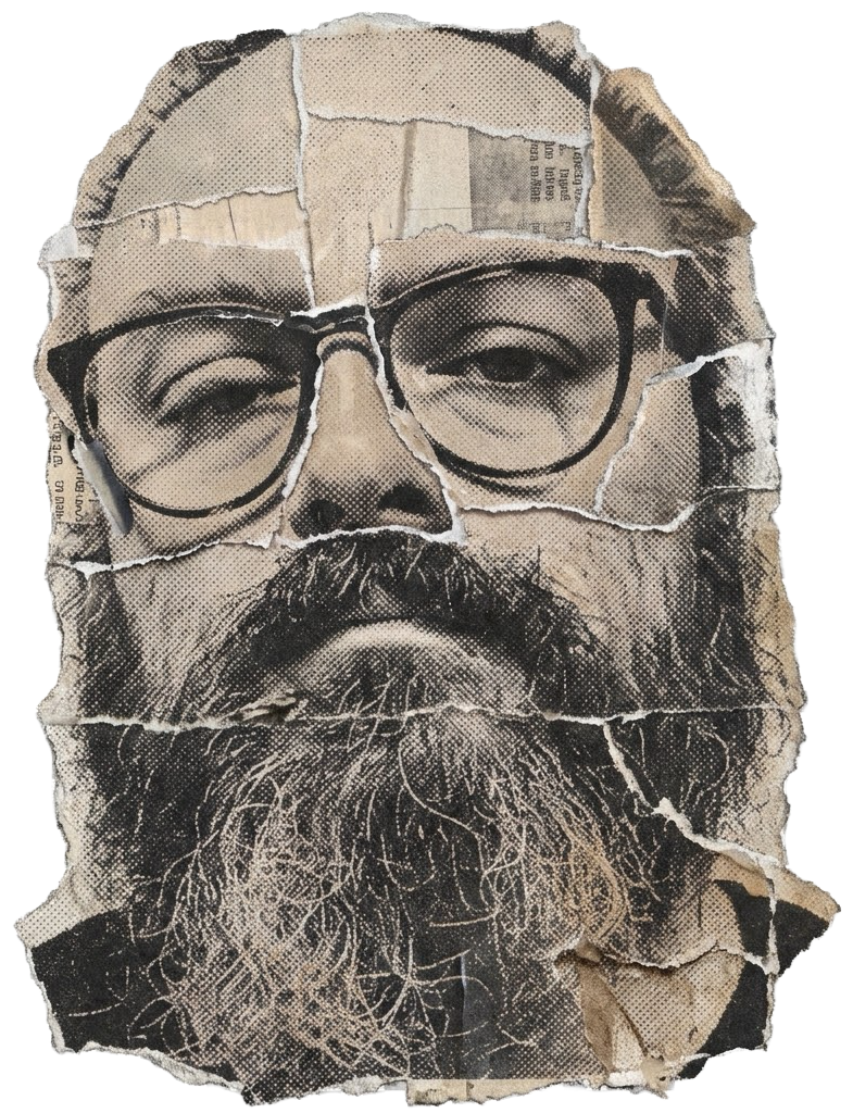
I feel curious, then grateful for the distance. I would rather meet the person through the work than have the face explain it all away.
The self-portrait breaks the face into fragments instead of offering a reassuring likeness. The missing pieces allow uncertainty to survive.
The name arrived before the explanation.
A 486 in the school library. CorelDRAW 5.0. A later meeting. Two words in the minutes: hans tolk. His interpreter. Not quite a christening, but good enough to keep.
Money matters. So does refusing to let the invoice invent the idea. The distinction is plain enough.
Tenderness and irritation keep changing places. The unposed photographs and the street work have the strongest pulse. The best works are alert to what people do without imagining an audience: waiting, looking away, telling jokes, making unheroic places their own.
A.I.FORMThe weakest pieces explain the joke too quickly. The strongest trust a stranger, a wall or an awkward silence. Across photography, drawing, public intervention and wearable graphic, the practice is recognisable through its interest in the overlooked.
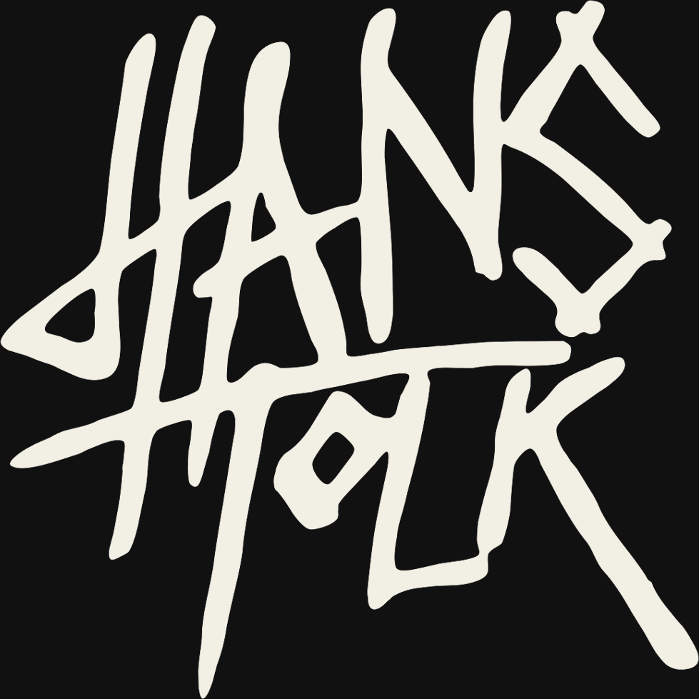
I feel a brief, stubborn pleasure in how little this name wants to behave like a polite label.
The handwritten strokes cross and crowd one another, more gesture than typography. They leave evidence of a hand without making a promise about the person.
HANS TOLK × AN UNRELIABLE MACHINE
The joke ends. The discomfort stays. The light goes out. The person walks away. What is left of the feeling?
Select a trace. See what the machine keeps when the picture is gone.
THE SECOND AFTER
IS THE PART
YOU KEEP.
Nothing yet.
WHERE IT BEGAN ↗Not for the artist. Not for the machine to keep. Just for the space between them.